THE POWER OF COLOR
#07
BY SANDRA HEYMAN & ROCíO FONTANA

 5 min
5 min
THE POWER OF COLOR
Now, if every new product or category aimed to stand out through a differentiated visual identity and a new color combination, the world would be full of chromatic richness — but many argue that the opposite is happening: color is disappearing from the planet. How is that possible?
Multiple studies suggest that the world is becoming less colorful. Evidence of this decline is based on research by the Science Museum Group Collection, which found that the use of gray, white, and black has increased since the 1800s. Researcher Cath Sleeman examined the evolution of more than 20 categories of objects — selecting the most commonly used — to study how their colors have changed from the 19th century to the present day, and discovered that the objects around us are far less colorful, showing a clear chromatic decrease over time.
Naturally, part of this is due to materials — wood, for example, is almost never used today to make televisions or phones — but it’s also a matter of taste. If we think about kitchens from the 1970s or living rooms from the 1960s, with yellow, green, and brown wallpapers, we can see how contemporary design now focuses more on harmony in darker tones. As a result, gray has increasingly become the protagonist. Our homes and workspaces are becoming less colorful, and this “graying” trend began in the late 1980s.
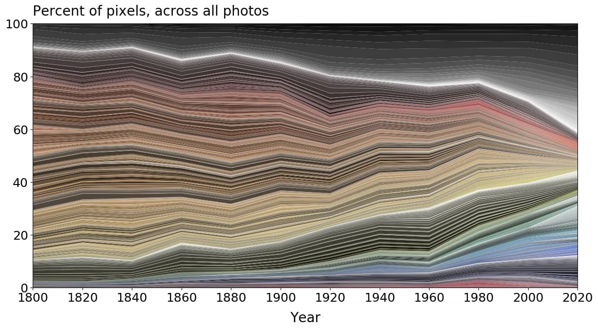
Many companies began using increasingly neutral and generic colors in the 1980s to mass-produce and appeal to the largest possible number of consumers. For example, Apple relies mostly on dark and neutral tones because a bubble-gum-pink iPhone might not be appealing to everyone. Today, most cars manufactured are white, gray, or black — grayscale tones rose from less than 50% in the 1990s to over 75% today — and the most popular carpet color is gray. In addition, the most popular interior paints are found in shades of alabaster, linen, or fog.

The world is slowly losing its colors as minimalism and monochromatic trends take over with muted tones. In both interior and exterior design, what’s considered “modern” seems to come hand-in-hand with monochrome palettes. As minimalism gained ground in the pursuit of “simplicity,” it also reduced the variety of colors. This tendency is evident in the fashion industry as well: black, white, and gray are the most popular colors across all types of garments, diverging from color and pulling attention away from individuality. We are, in effect, witnessing a significant decline in the use of color across multiple industries.
Vibrant colors had their moment in the 80s and 90s with The United Colors of Benetton, and there was still a last wave in the early 2000s with the iMacs. Curiously, while science-fiction films often portray the future as a monochromatic environment — and literary dystopias also imagine it devoid of color — our modern culture has adopted that same palette… by choice.
The real problem is that color has a profound effect on the human brain, far beyond aesthetic pleasure. As we saw earlier, color influences many aspects of our lives — from our emotions to our physical strength and even our heart rate. Studies from BMC Medical Research Methodology found that people facing depression and anxiety often choose gray to represent how they feel, and because gray has been the most commercially used color in the last 30 years, its overuse could potentially generate negative feelings in society as a whole.
In her TED Talk, Dagny Thurmann-Moe explains that color directly influences our mood and mental health. As mammals, we have an innate inclination toward biophilia — the need to connect with nature. Greens, blues, reds, and yellows calm us instinctively, while grays can trigger fatigue, lack of concentration, anxiety, stress, and even isolation. Her recommendation: expand the palette of colors in our surroundings. It’s not an aesthetic preference — it’s an essential aspect of well-being.

One of the few places where bright, intense colors are still used is in corporate branding and app icons. As Patricia Thenisch explains in her TED Talk about the hidden power of colors, the brain “thinks in colors,” which means we should use them to our advantage. To prove it, she shares a personal experiment: by reorganizing her apps by color, she managed to save 22 hours over the course of a year.
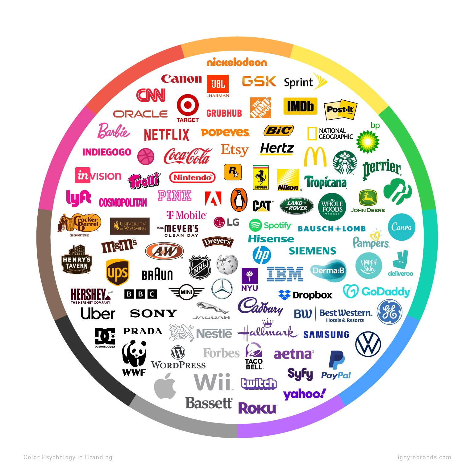
Do bright colors symbolize anything? David Batchelor, in his book Chromophobia, explains how in Western culture — dating back to Plato and Aristotle — color has long been considered “foreign to the highest processes of the Western mind”. Since the nineteenth century, color has been described as secondary in works of art. Form was primary, while color was seen merely as a quality “more Eastern than Western, more feminine than masculine, more childish than adult. Colors are associated with hedonism and appetite, not with serious reflection or deep consideration”. Perhaps this aversion to color in our society reflects the supremacy of rationality, where the educated class focuses on what is deemed important and not on something that — mistakenly — is seen as superficial or trivial. Today, the conservative sector shows aversion to color, rejecting the rainbow flag and criticizing brightly colored hair, leaning toward neutrality and rewarding ambiguity instead of differentiated expression.
However, the pandemic seems to have triggered an emerging return of vivid colors. Some even warn that color is coming back stronger than ever. While there is still not enough evidence, two tendencies may be shaping the reappearance of color in the post-pandemic era: one favors soft, enveloping tones that evoke serenity and kindness after such a turbulent period; the other embraces more vibrant and daring colors that call for energy and optimism. In both cases, greens, blues, and pinks have grown in popularity.
As we have seen, colors hold cultural and symbolic meanings across traditions as well as within systems of identity and belonging. In art, design, and advertising, we rely heavily on color to convey emotions, depth, and narrative. At VEO Branding Company, the color palette is a key tool when developing brand identity. We recommend using color strategically, selecting palettes that build brand associations, strengthen recall, and spark emotional responses.
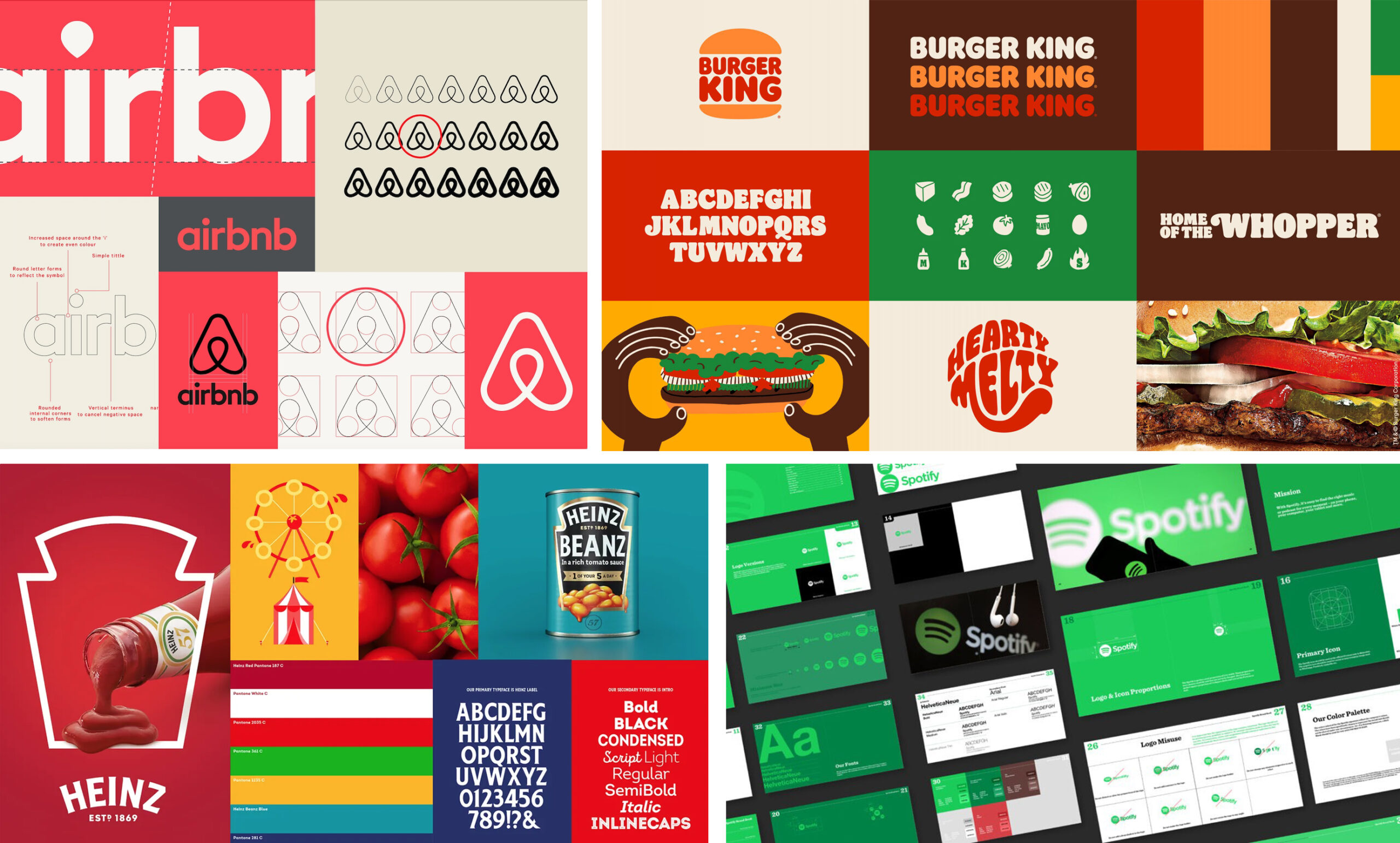
At VEO Branding Company, we believe that the effectiveness of a campaign can depend, to a large extent, on the choice of its colors. Color stops being an aesthetic detail and becomes a strategic resource that defines a brand’s identity and its ability to connect emotionally with people. It is a key element for omnichannel consistency, since chromatic coherence helps unify the brand experience, reinforce the message, and create a more memorable moment that facilitates recognition. Additionally, it must remain cohesive across audiences — from employer branding to the customer purchasing the most premium service.
At VEO Branding Company, we believe that color, far from being a trivial detail, is a primal need with tribal utility. Brands should use it in the right measure to balance who they are and what they know how to do with what the user needs them to solve.

Sandra Heyman & Rocío Fontana
Sr. Brand Strategist & Sr. Designer
