WE TOOK CONTROL OF MERCADO PLAY

#00
BY SOLANA BERTI
 5 minutes
We took control of Mercado Play
A few months ago, we took on the challenge of rebranding Mercado Play. We had already worked with the brand on other projects, but this process called for us to take things to the next level. The goal was to support its new business strategy, including the addition of rental and subscription titles.
To support this commercial shift, VEO led a rebranding process focused on communicating a renewed value proposition aligned with the business’s new objectives. Once we had defined the territory, the promise, and the claim that became our guiding principle — “Take control. Watch what you want.” — we moved on to what, for me, is the most exciting part: finding a visual system that could bring that concept to life while also being part of something bigger.
We don’t know everything, but when it comes to Mercado Libre brands, we do have some experience. We knew this business unit needed to stand out, while always making sure the essence of the broader ecosystem remained intact. And sometimes, working within a framework with so many boundaries becomes an incredibly creative challenge. On top of that, the industry category the brand operates in has its own particularities, and we needed to take those into account.
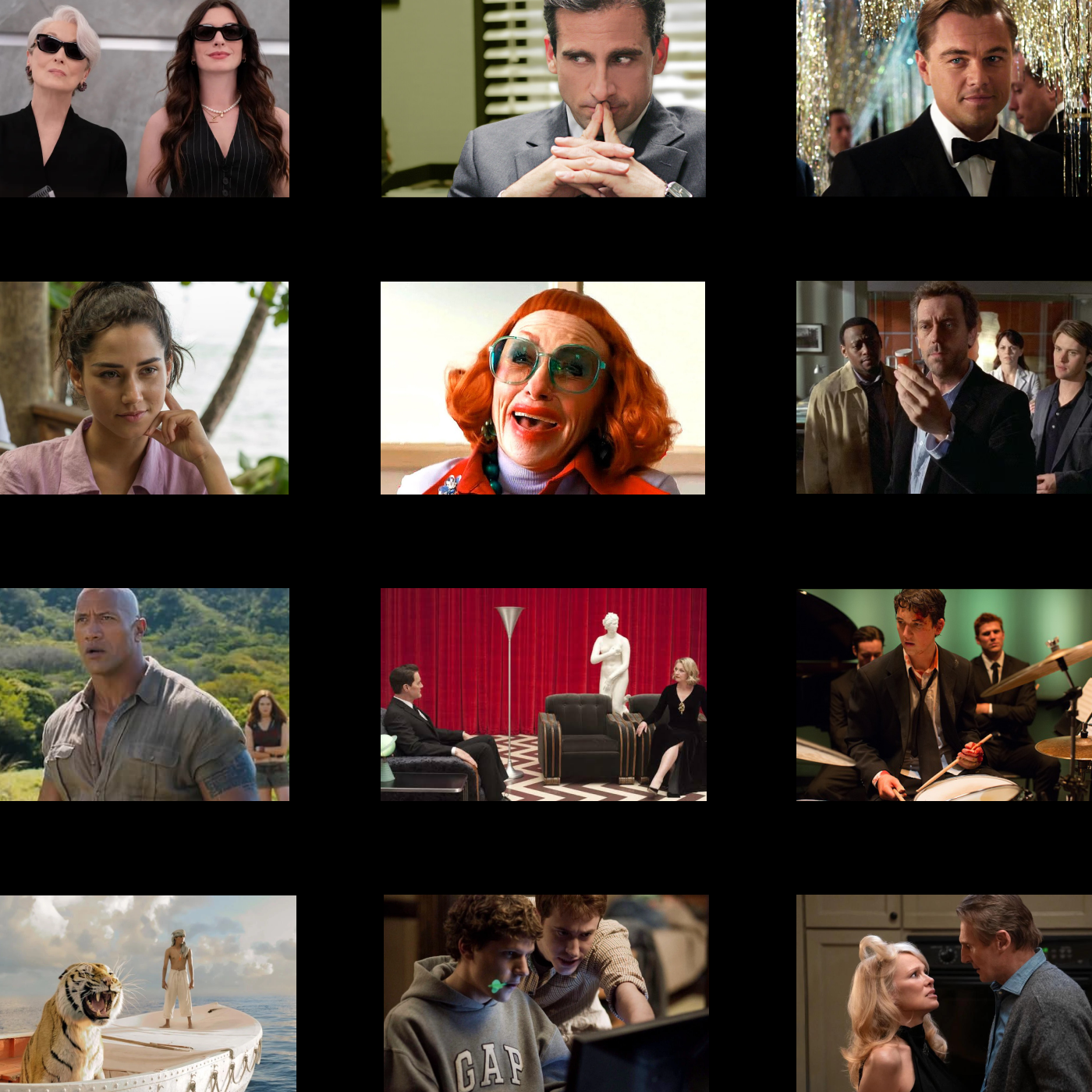
Since Mercado Libre had recently refreshed its identity, the first thing we did was update the logo’s blue to the new shade, bringing it in line with the current ecosystem. With that done, we started watching movies — yes, for inspiration. We brought in fan-favorite characters and paired them with Extra Bold typographic headlines for maximum visual impact. Then we placed them against a cinematic black canvas, and just like that, we had our essential assets.
We then decided that the content needed a frame: the “box,” inspired by the yellow highlight that appears on the platform when you choose what to watch. But we gave it a twist: we took the character outside the frame. It was a simple change, but one that created the immersive effect we were looking for, making the content feel like it was moving closer to the user.
From there, the challenge was to make sure the entire system worked in harmony. If you’re doing branding and you don’t test for consistency, the work doesn’t make sense. We designed assets for every type of content — free, rental, and subscription — building a system with more constants than variables to strengthen brand recognition. CTAs and iconography helped us segment the offering, while headlines and supporting copy anchored each piece within the conceptual territory.
We put the system to the test across banners, ads, and sliders, both within and beyond the Mercado Libre ecosystem. Our job was to make sure the brand spoke consistently at every touchpoint. Since Mercado Play works with many strategic partners, we developed extensions to the main Brandbook so the core identity could coexist with partner brands without losing its essence. This allowed us to establish clear guidelines for how the identity should be used and behave, giving the system the structure it needs to scale across the region without losing consistency.
At VEO, we like to think of ourselves as brand guardians. All our clients know that our work doesn’t end when the Brandbook is delivered. That’s actually when the brand starts to live, grow, and mature. We design with flexibility in mind because we live in a world of constant, fast-paced change. But above all, we become our clients’ partners: we’re not afraid to raise our hand and suggest a change when we see something isn’t working, or to send a virtual hug when things turn out exactly as we envisioned. We build brands as a team, and we stand by them by taking care of them together.
Solana Berti
Art Director