SaltMe®!
Full Flavor, Less Sodium
Client
SaltMe®!
Year
2021
Country
United States
Sector
Food
SaltMe®! is the Miami-based brand of reduced sodium potato chips that has arrived to satisfy all those who want to have a healthier lifestyle without sacrificing a treat now and then.
At a time when healthy snacks are gaining prominence in people's diets, they chose us to rebrand and establish a solid and distinctive positioning.
Rebranding
Positioning
Visual identity
Verbal identity
Packaging


Brand challenge
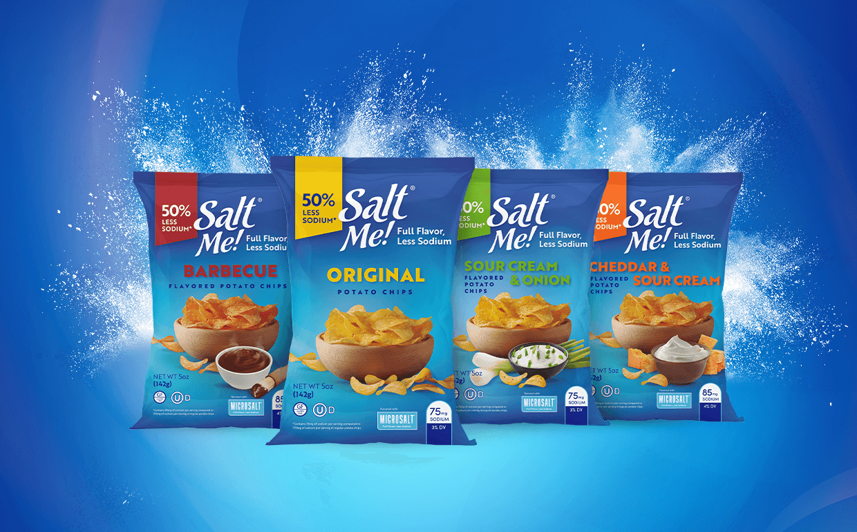
Our mission was to create a fresh identity and establish a strong positioning for this innovative brand. SaltMe®! aimed to break into and stand out in the highly competitive U.S. low-sodium snack market with a unique value proposition: reducing sodium intake by 50% without compromising the taste of potato chips.
What we did
We built an entirely new identity from scratch based on three strategic decisions:
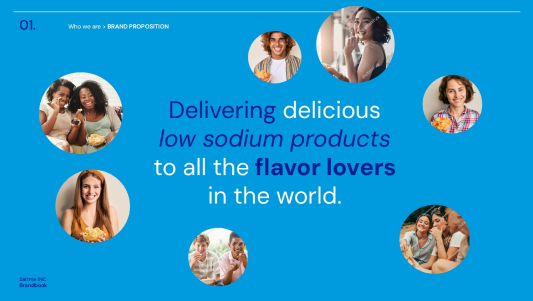
1. Position SaltMe®! as the best low-sodium snack option for all "flavor lovers."
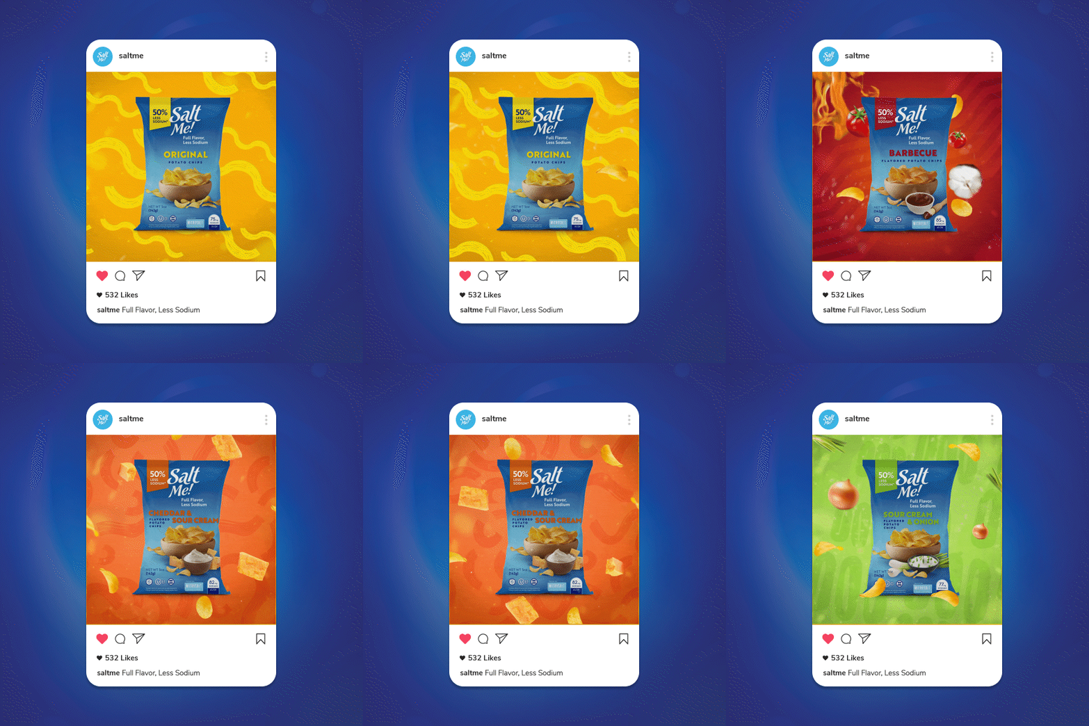
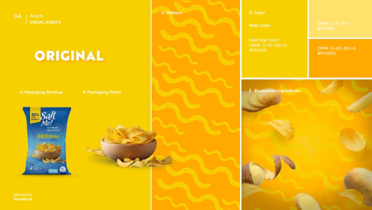
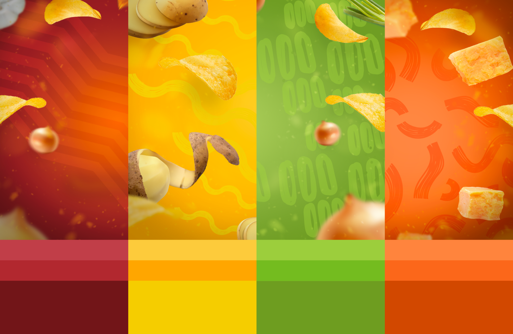
2. Select a color palette that allowed it to fit into the low-sodium market while retaining its "flavor."
3. Achieve a premium look to set it apart from competitors without losing the high-impact appeal of mass consumption.
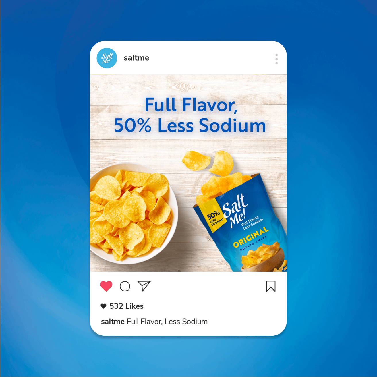
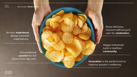
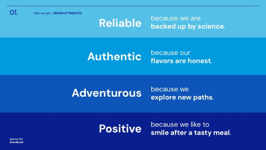
We redefined the brand's purpose, vision, and values to establish a solid positioning and condensed its value proposition into a simple, clear, and direct claim: "Full flavor, less sodium."
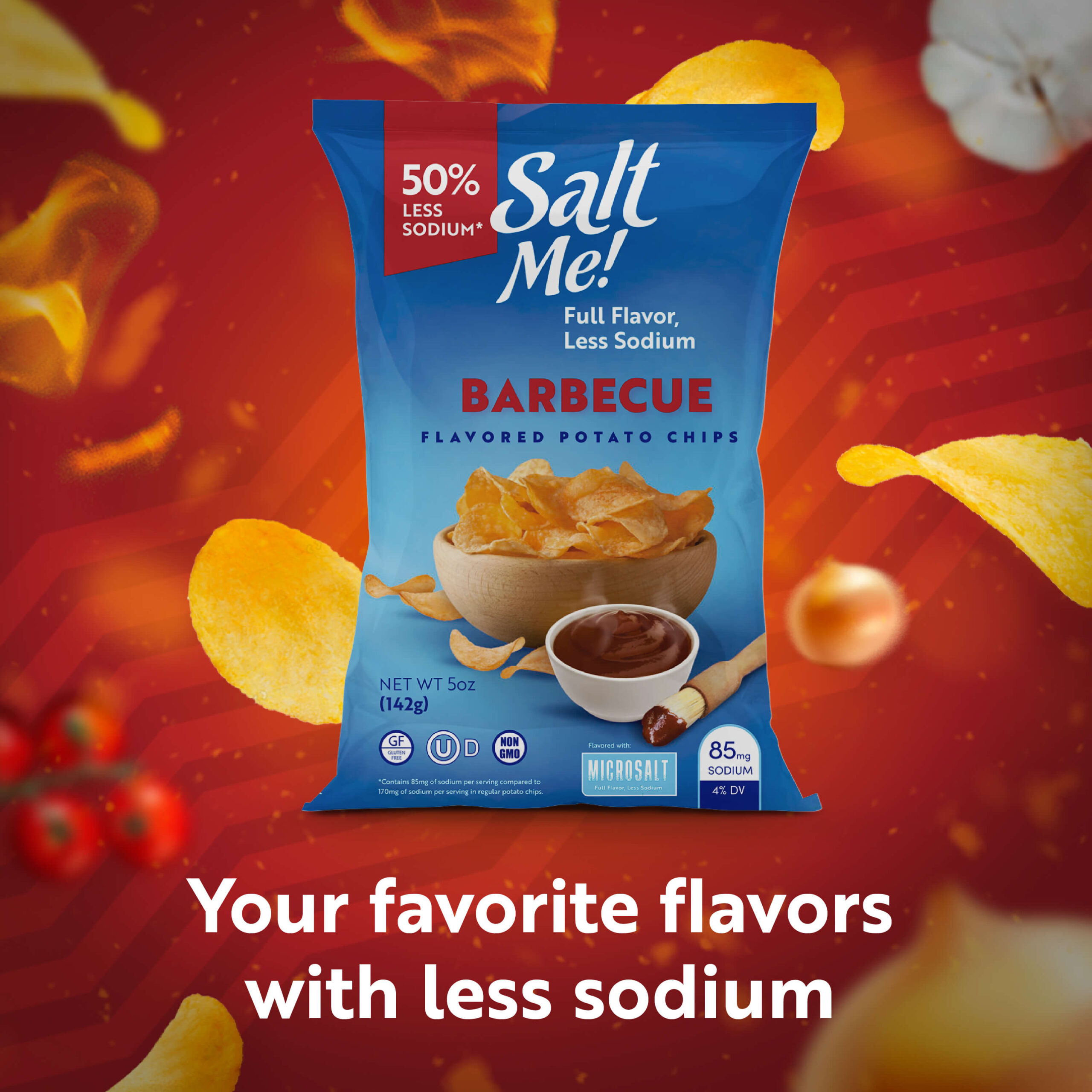
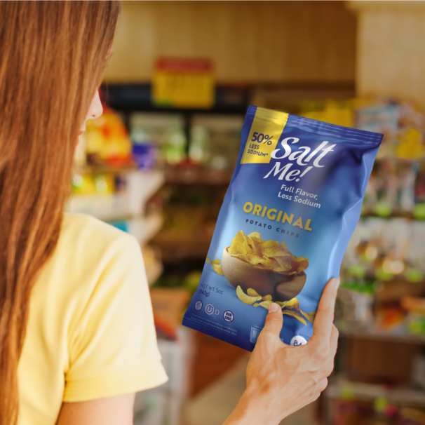
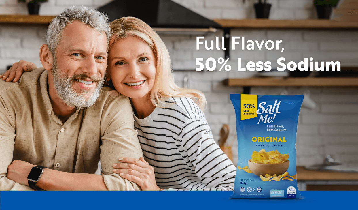
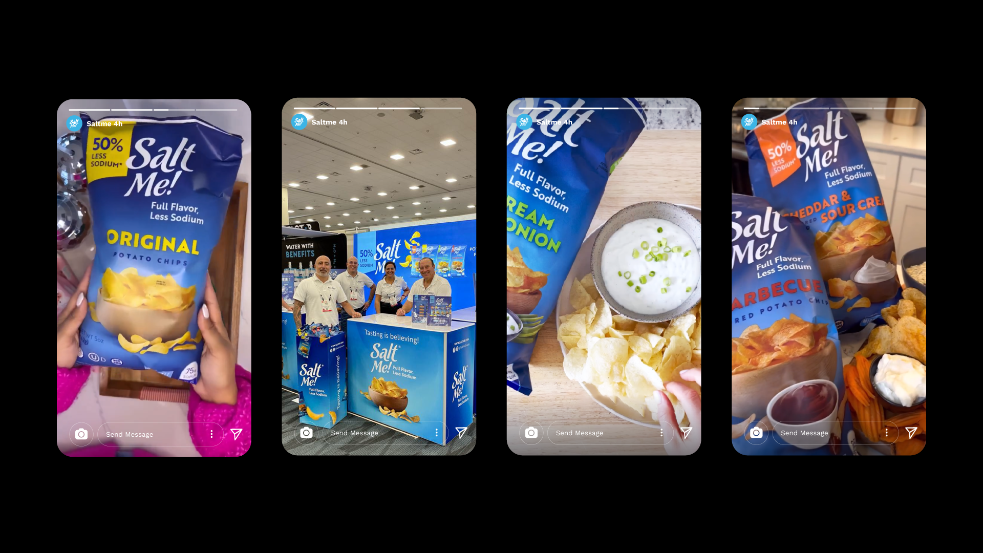
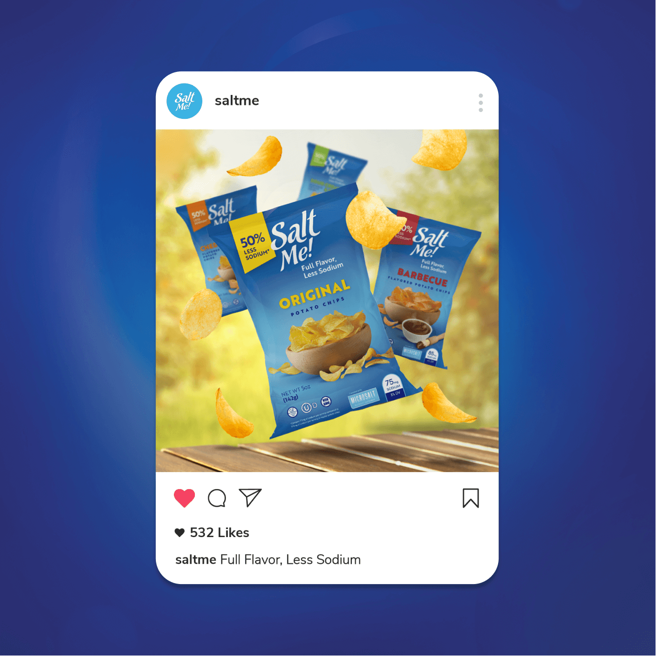
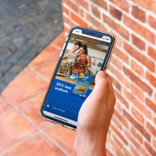
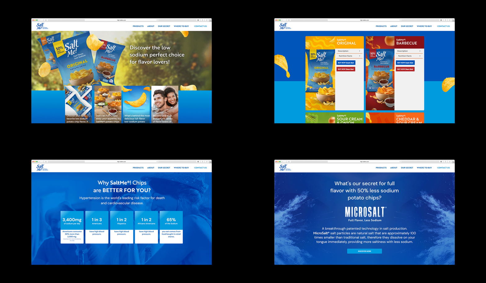
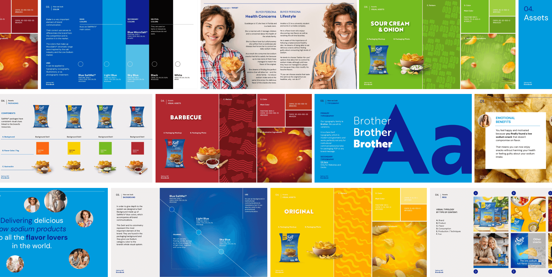
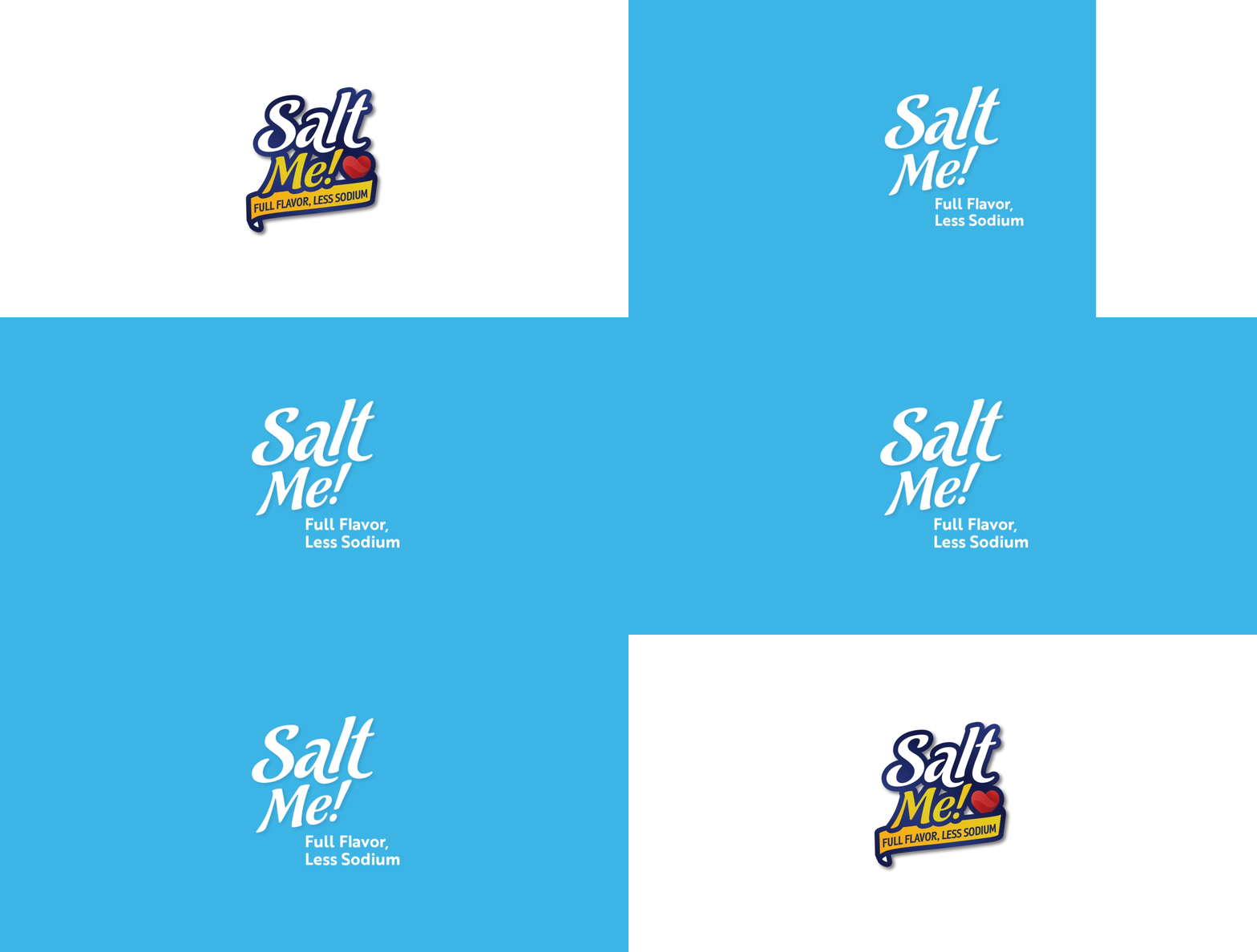
We simplified the logo to make it more human, honest, and visually appealing, qualities that resonate with an increasingly conscientious and discerning consumer base. We developed a color range inspired by the salt industry and low-sodium products to differentiate ourselves from the competition and gain a place in the market. The visual system is complemented by the choice of a modern typography and a photographic selection that includes people, products in context, and packaging to display the entire SaltMe®! universe in a relatable and cohesive manner.
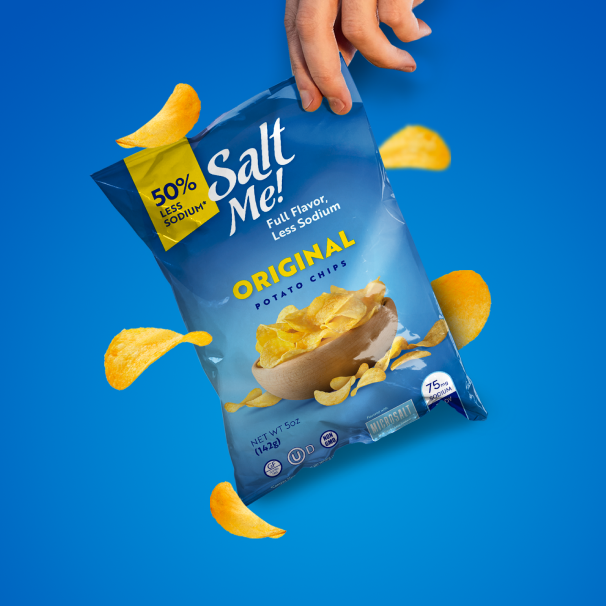
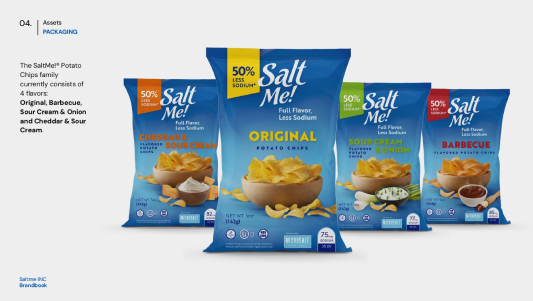
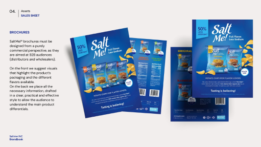
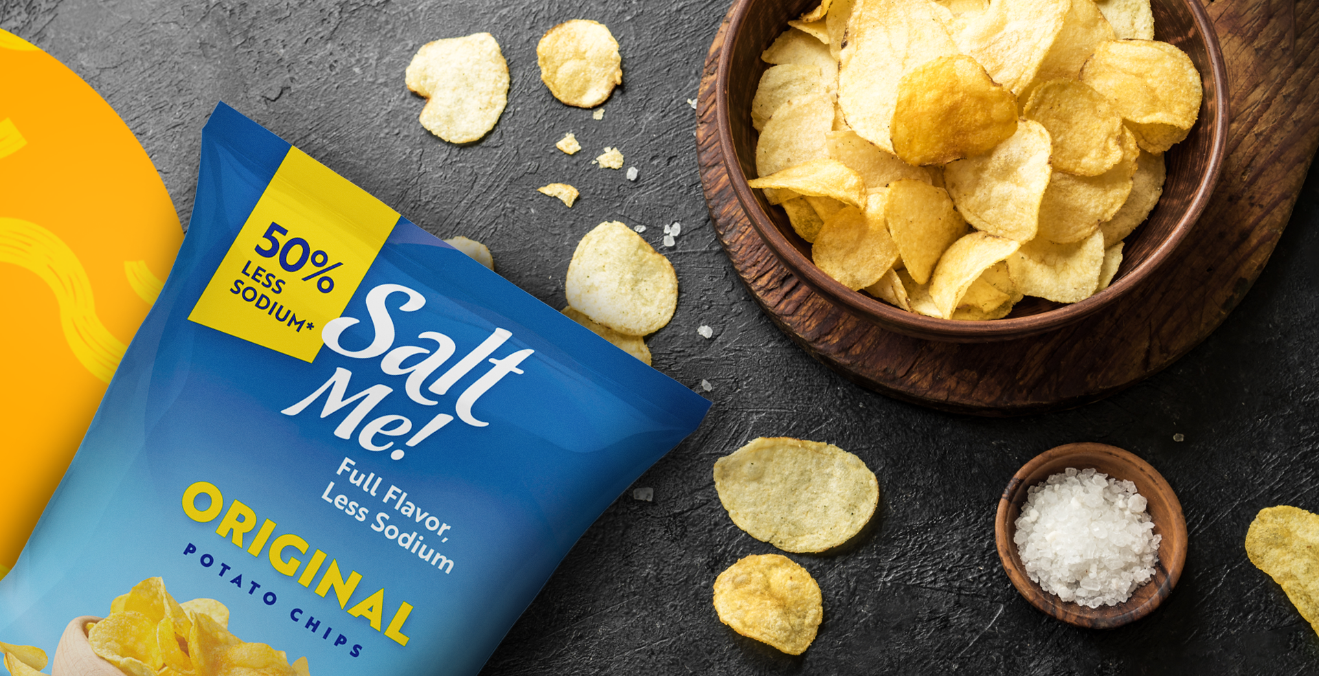
We completely redesigned the packaging with a matte finish and incorporated a "swirl," the brand's most crucial element, into the background to create versatility, depth, and enhance the perception of premiumness at the point of sale.
