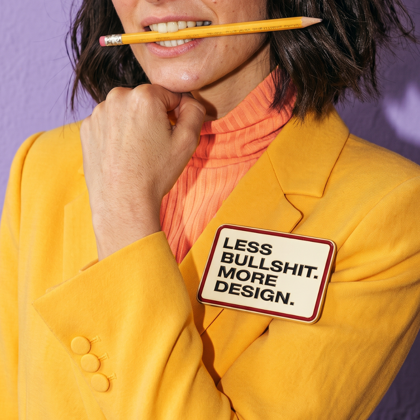
LESS BULLSHIT. MORE DESIGN.
 5min
5min
LESS BULLSHIT.
MORE DESIGN.
There’s one brief that comes up more often than it should: “We need it to look nicer.” Ha. Every time I hear it, I think the same thing: design has terrible PR.
That sentence assumes design comes in when everything important has already been figured out. The strategy is set, the product works, and all that’s left is to pick a typeface, move a logo around, find a nice color combination, and call it a day. Hmm. Not quite.
After many years of working with brands, I’m increasingly convinced the process works exactly the other way around. Aesthetics matter. A lot. But what really matters happens a little earlier: when someone hasn’t read a single word yet, but they’ve already seen an image, a logo, an icon—and started forming an idea.
We interpret before we understand. The arguments come later, but the first interpretation has already happened. And that interpretation rarely comes from an explanation. It comes from a set of visual decisions someone made long before.
That’s why I like to think of design as one of the most democratic languages there is. All it takes is seeing it for something to happen. It happens to all of us, every day.
Paul Rand put it beautifully: “Design is the silent ambassador of your brand.” Wow. I always come back to that quote because an ambassador does exactly that: they arrive before everyone else. They open a conversation, create a first impression, and shape everything that comes after.
Design speaks through the culture, strategy, and values of the brand it represents, beyond personal taste or whatever happens to be trending. And in doing so, it builds meaning before words ever appear.
The distance between what a brand is and what people perceive it to be can be enormous. It can make a clinic staffed by exceptional professionals look careless. Make an NGO look like a giant corporation. Make a company genuinely committed to sustainability look like just another case of greenwashing.
A typeface can communicate closeness or distance. A visual system can organize a complex idea or make it harder to understand. An identity can make an organization’s purpose visible—or hide it behind clichés.
Design operates at the level of interpretation. That’s where it builds or destroys perception, long before it touches reality itself. And that gap is never insignificant.
That’s why some processes can look obsessive from the outside: spending hours debating typographic hierarchy, testing twenty versions of the same color, moving a pixel, moving it again, then debating it all over again.
All those decisions, accumulated over time, end up shaping perception. And perceptions, although invisible, have very tangible effects.
Today, any AI can generate an image in ten seconds. And to be fair, sometimes the result is incredible. But empty aesthetics have become commonplace. Technology has democratized execution in a way that seemed impossible just a few years ago.
And it has also made one thing very clear: the difference lies in producing meaning, far more than in producing images.
A design can be beautiful and say absolutely nothing. It can follow every trend and still fail to speak to anyone. It can grab your attention for five seconds and disappear by the sixth.
Design has always been—and still is—about making decisions: what to show, what to leave out, what to emphasize, what to simplify, what story deserves to be told before any other.
That’s why I struggle when a conversation about design ends with “I like it” or “I don’t like it.” Taste changes. Interpretation remains.
And that’s where, I think, the real social function of design comes in: helping people better understand what’s in front of them.
Every visual decision proposes a way of reading something. And every reading inevitably creates meaning.
Maybe that’s why the best design is the kind that gets an idea across so clearly that no one stops to think about the design at all.