MicroSalt®
Full Flavor, Less Sodium
Client
MicroSalt®
Year
Country
United States and United Kingdom
Sector
Food
MicroSalt® is an American brand with an innovative product and a purpose as noble as it is necessary: to reduce sodium intake without compromising the taste of meals.
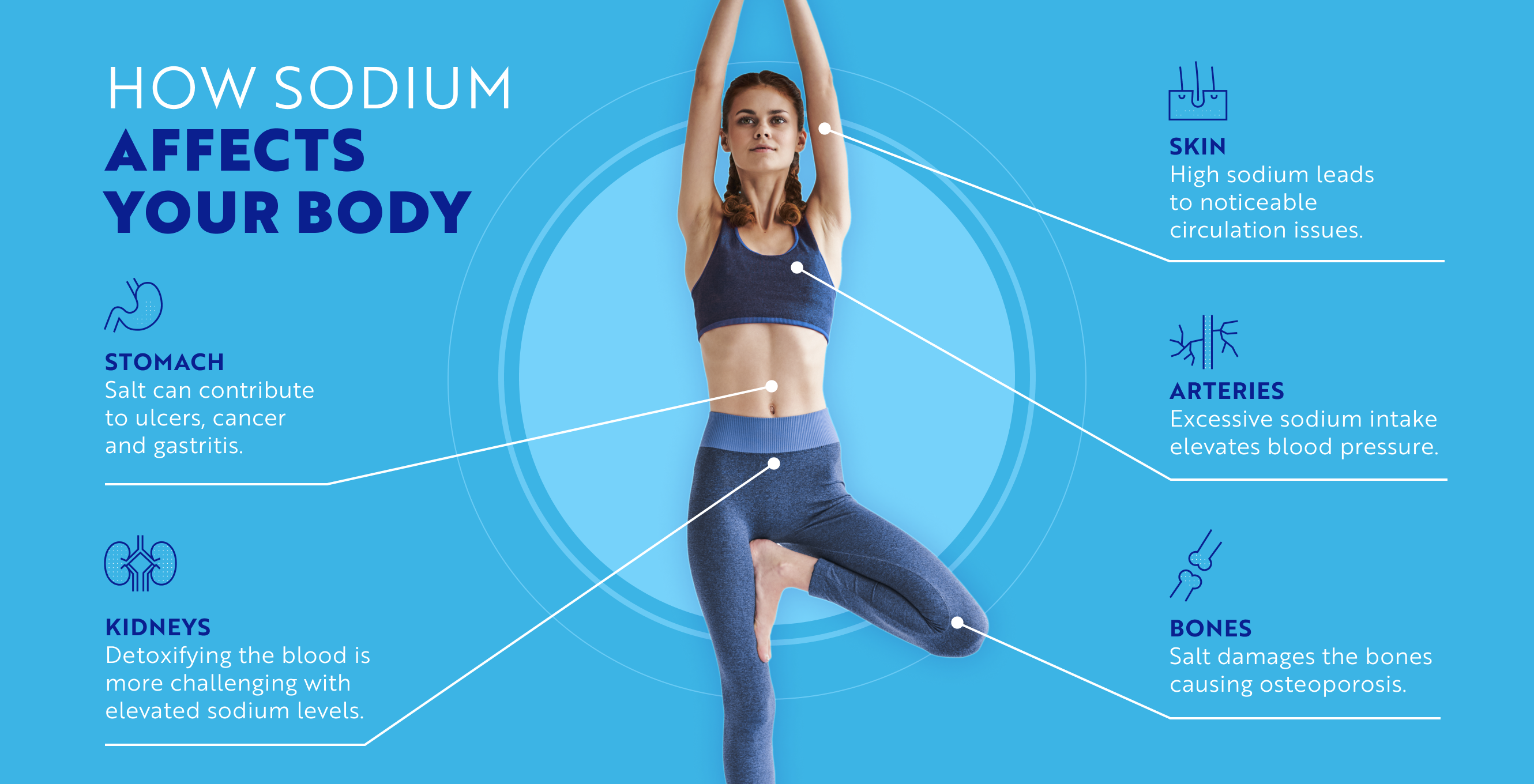
31% of global deaths are related to cardiovascular diseases caused by high sodium intake. In this context, they chose us to do their rebranding and establish a strong and attractive positioning both at the B2B and B2C levels.
Rebranding
Positioning
Visual Identity
Verbal Identity
Packaging


Brand Challenge
The challenge was essentially to create a trustworthy and relevant brand whose product is so innovative that there is no other like it in the market. It has some competitors that approach its value proposition, but they all fall short.




What We Did
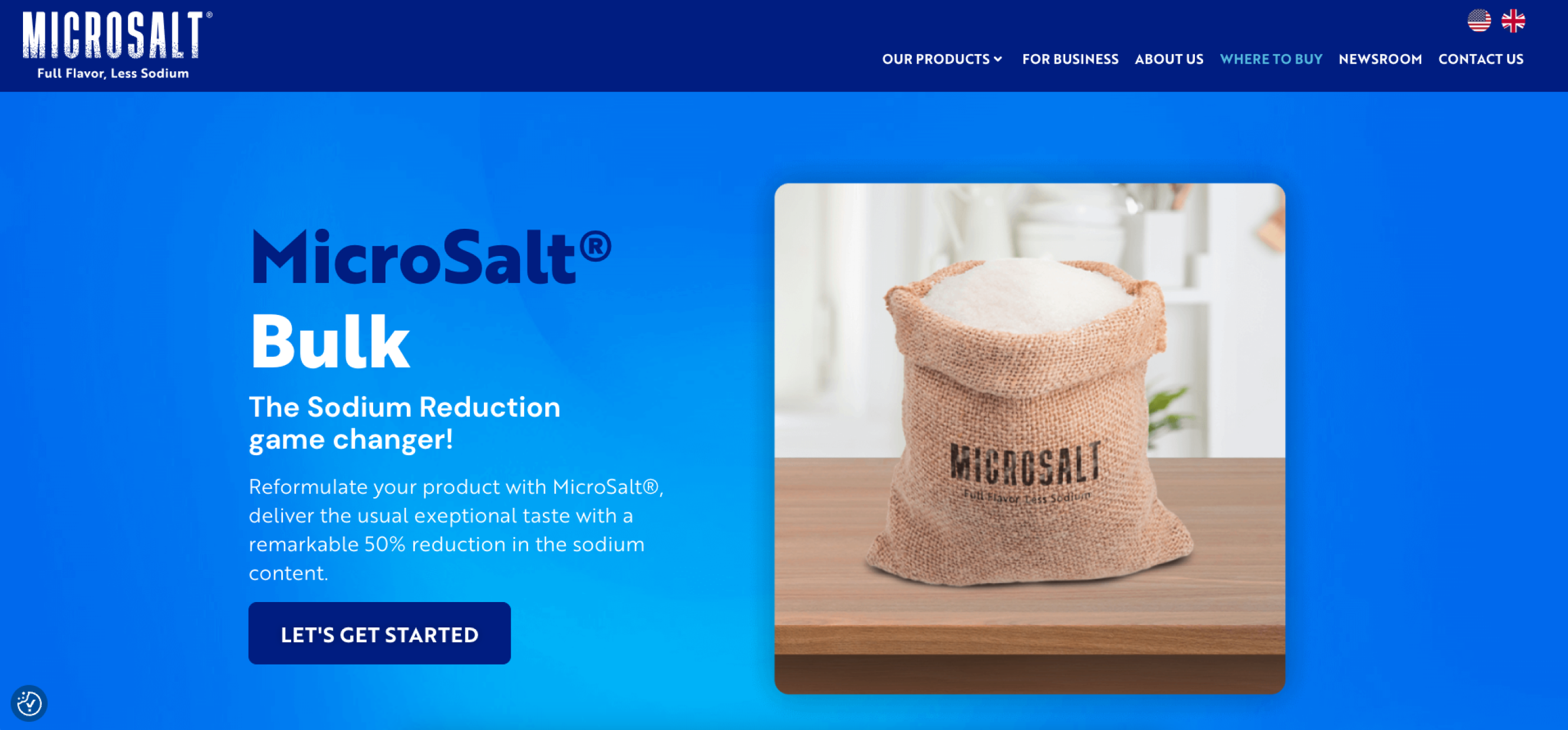
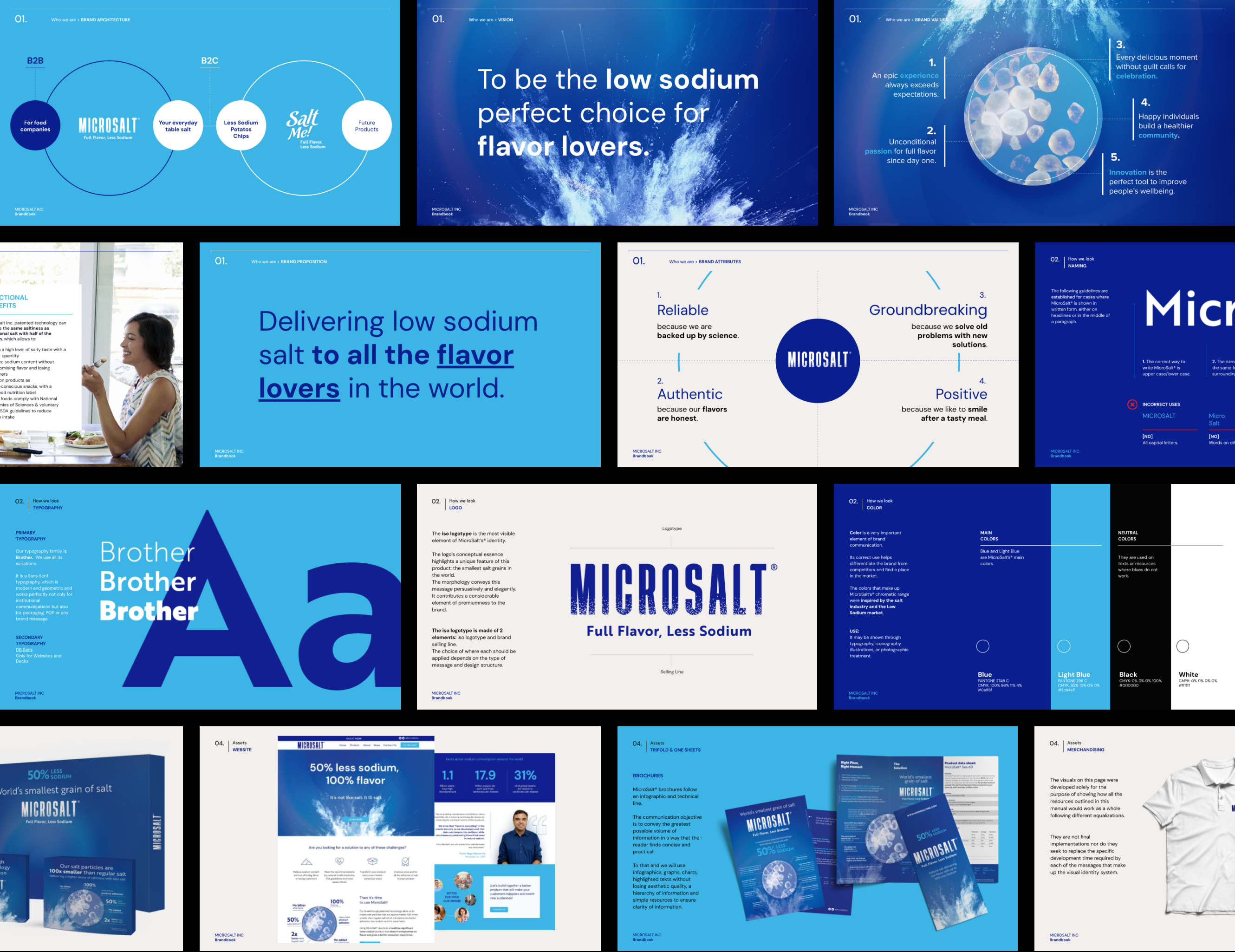
We proposed a versatile positioning in which MicroSalt® stands out as a key partner for companies in the food industry and represents, at the same time, the perfect solution for those individuals who need to reduce their sodium intake and do not want to compromise the taste of their meals.
We combined experience, innovation, passion, and authenticity in the brand's voice to inspire companies to change the game, and individuals to live a fuller and healthier life.
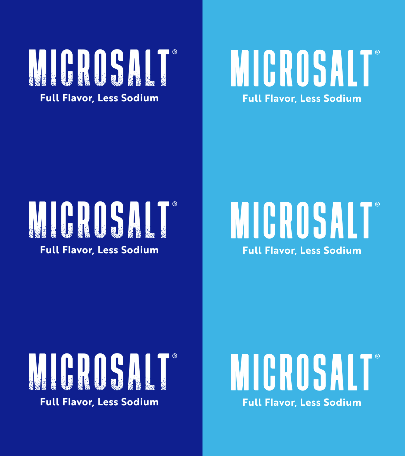
We designed a sophisticated logo that brings together different elements with a strong conceptual load that highlights one of the main differentiators of the brand: the world's smallest grain of salt.
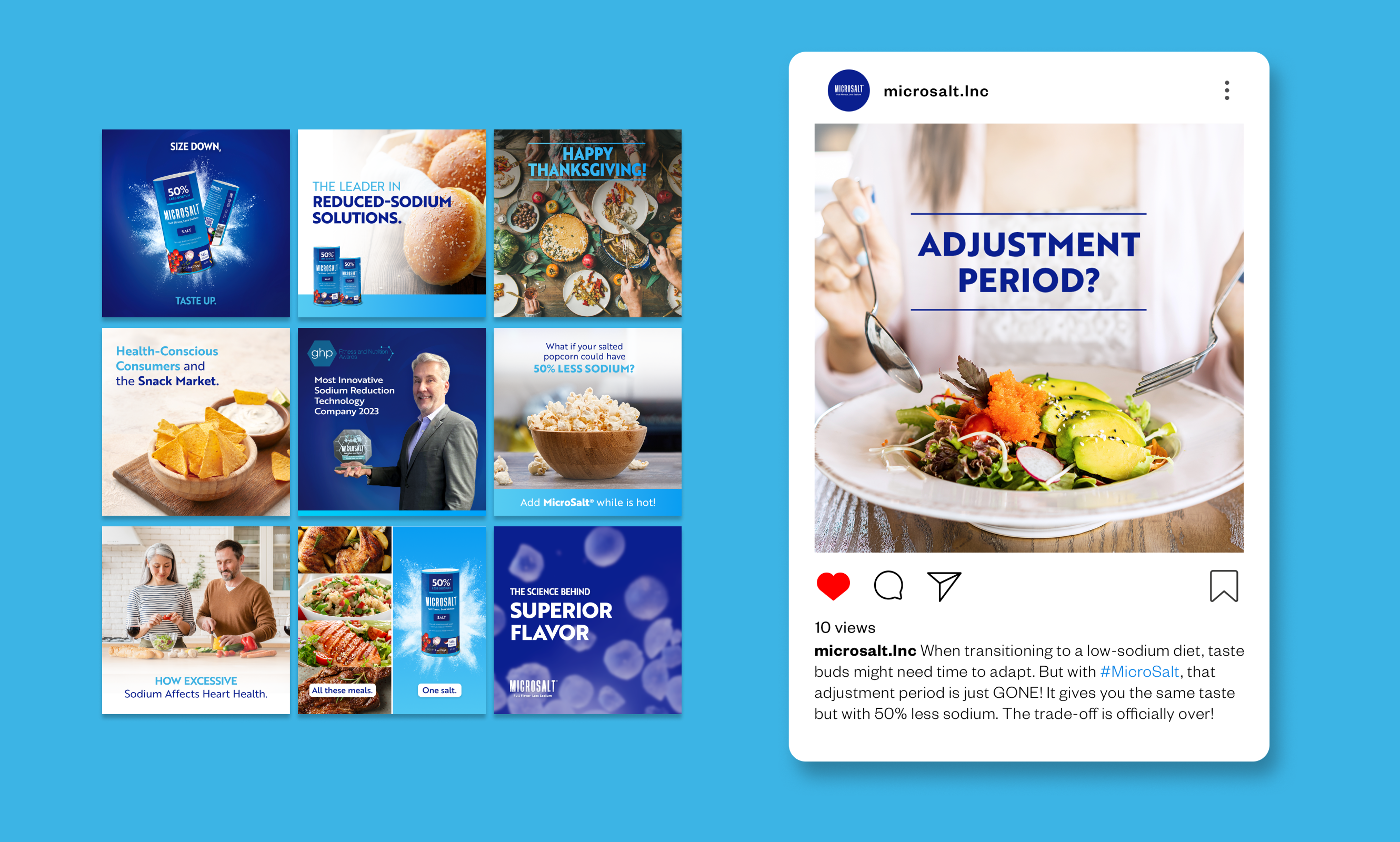
We defined a chromatic range inspired by the salt industry and low-sodium products. We selected a modern typography to connect the brand with the technological universe in a clear and direct way.
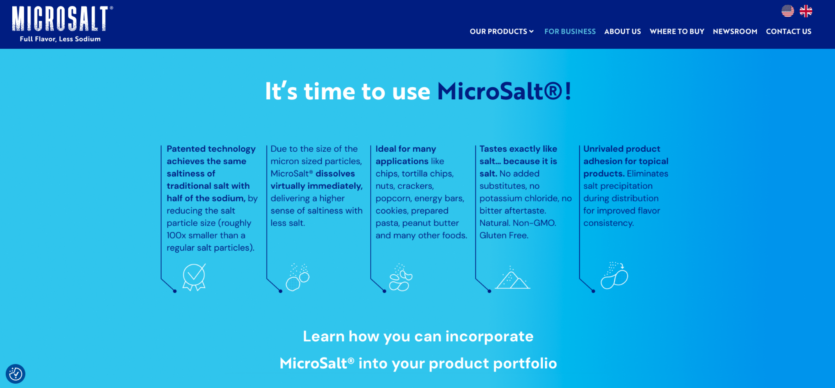
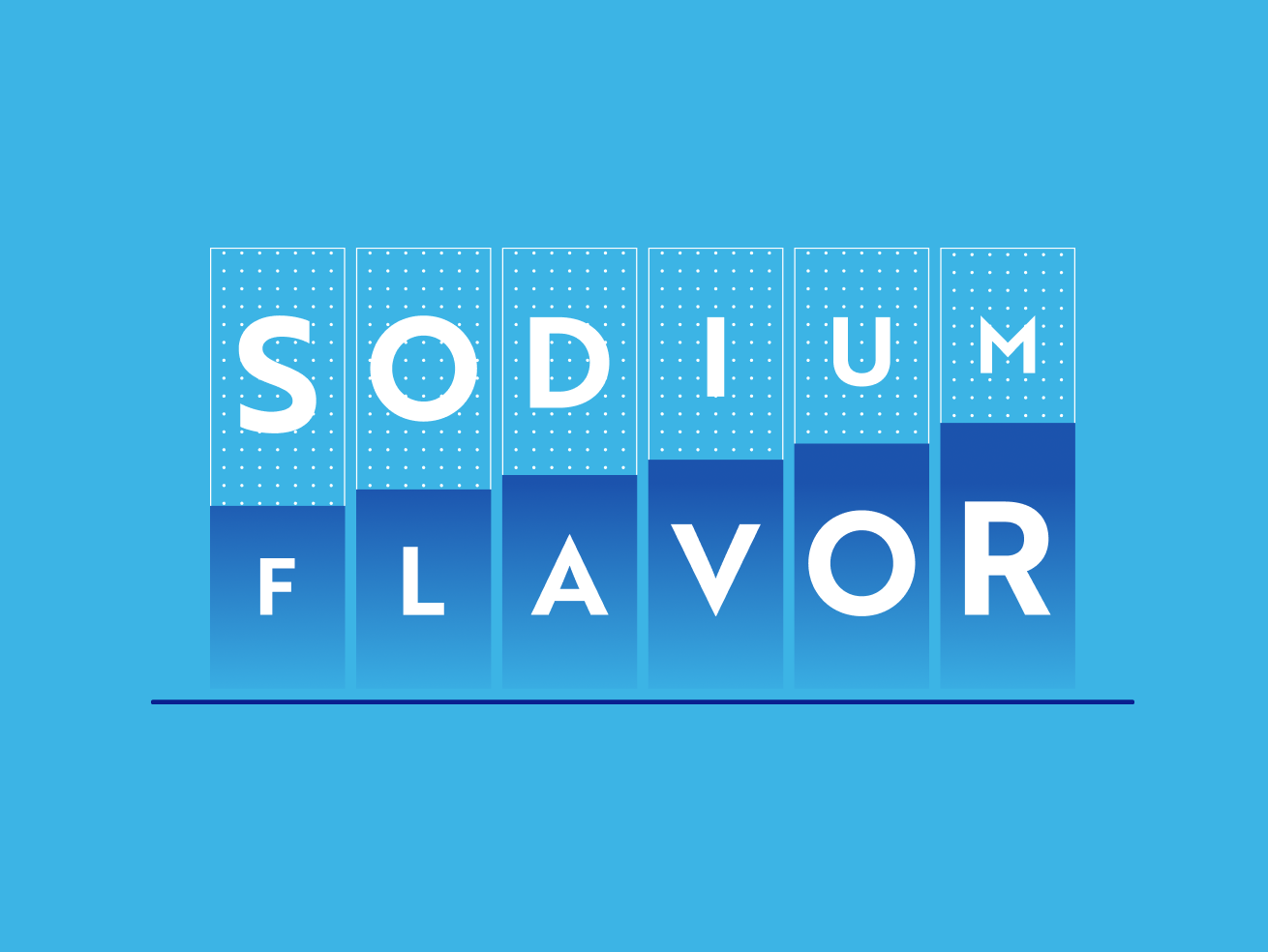
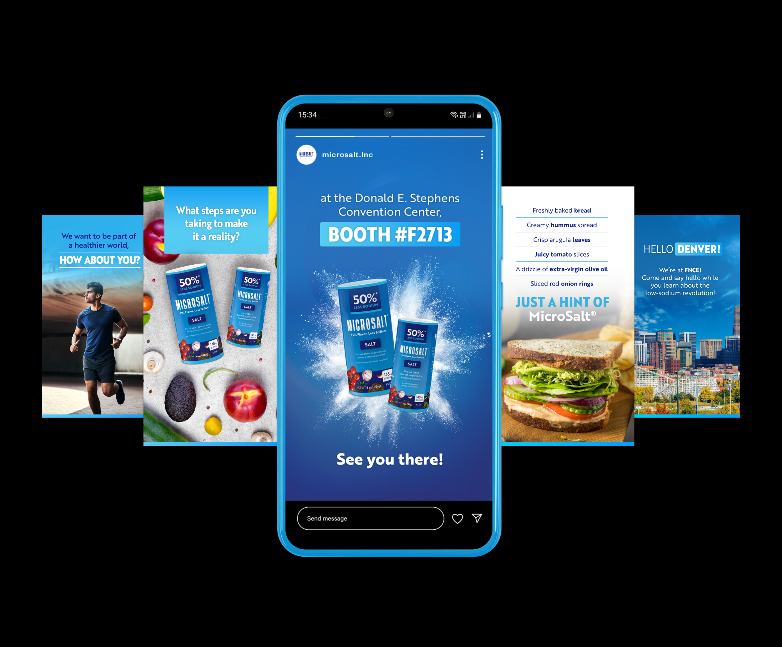
We established different visual resources with lines and gradients that convey premiumness and simplify the communication of processes and relevant information for the audience.
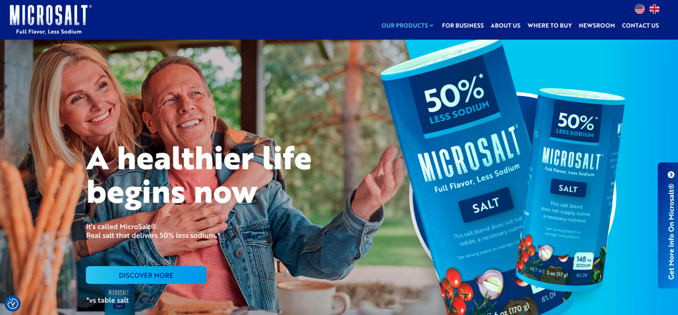
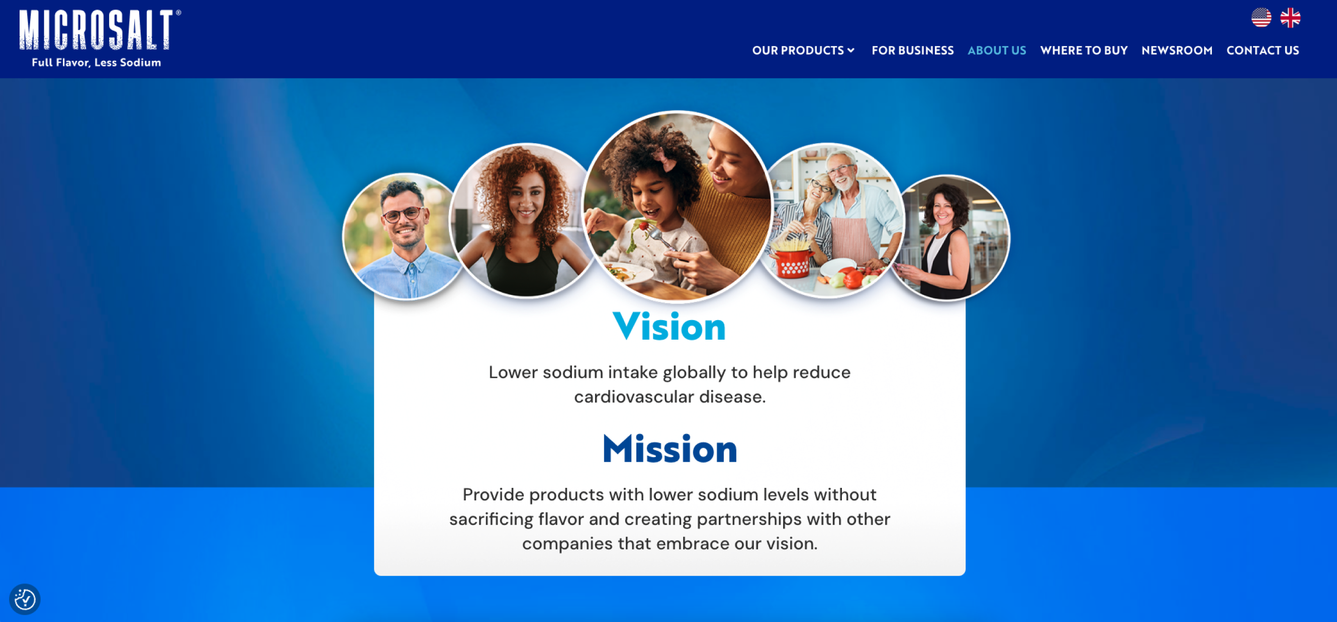
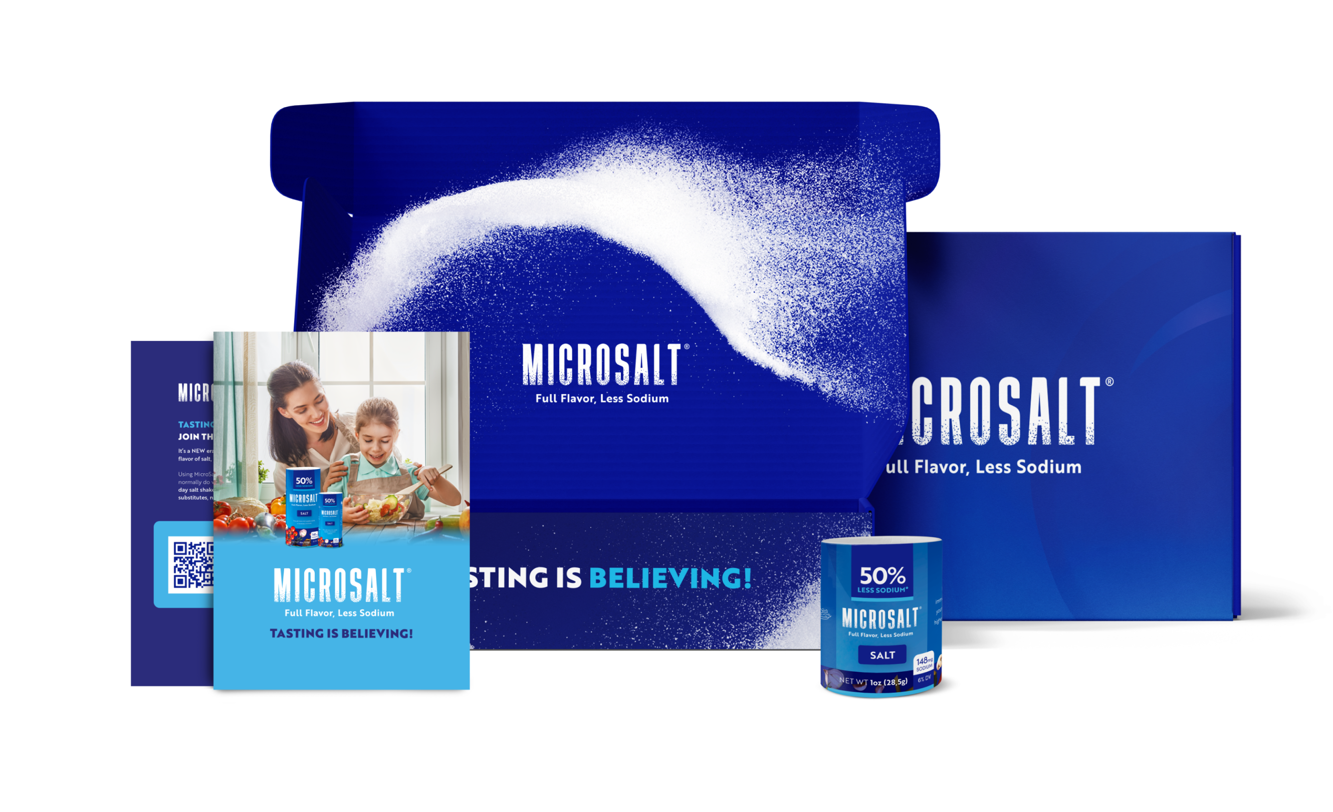
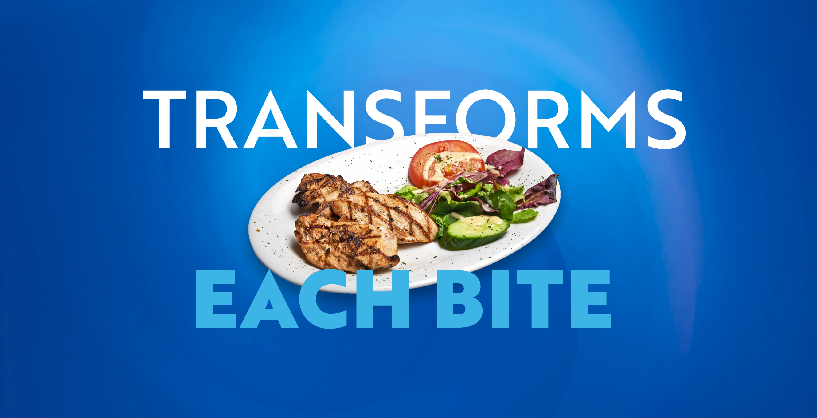
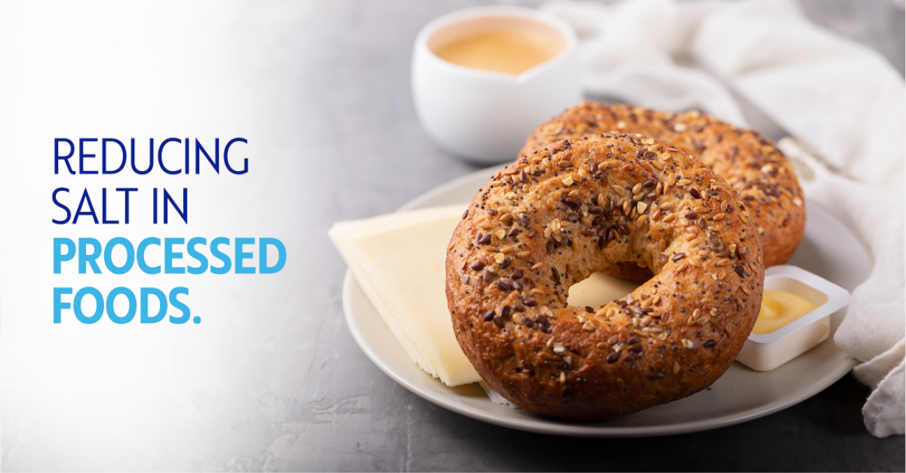
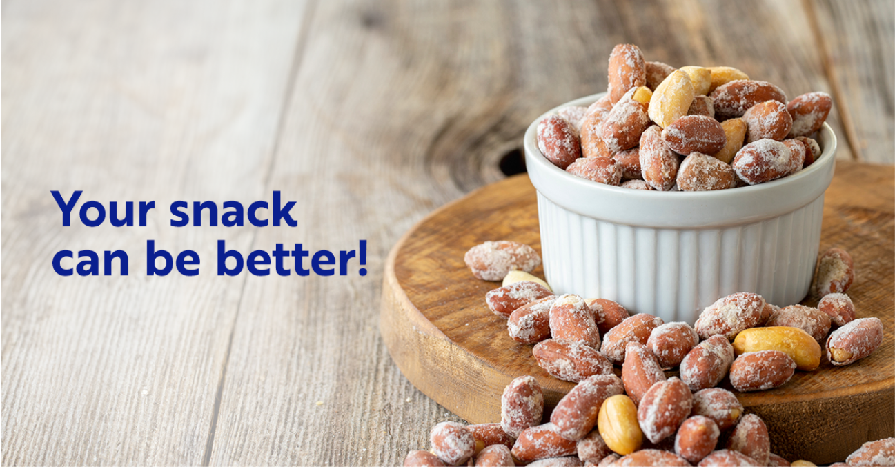
We completed the system with a clean, natural, and spontaneous photographic style to achieve the perfect balance that allows MicroSalt® to belong and stand out in one of the most competitive markets in the world.
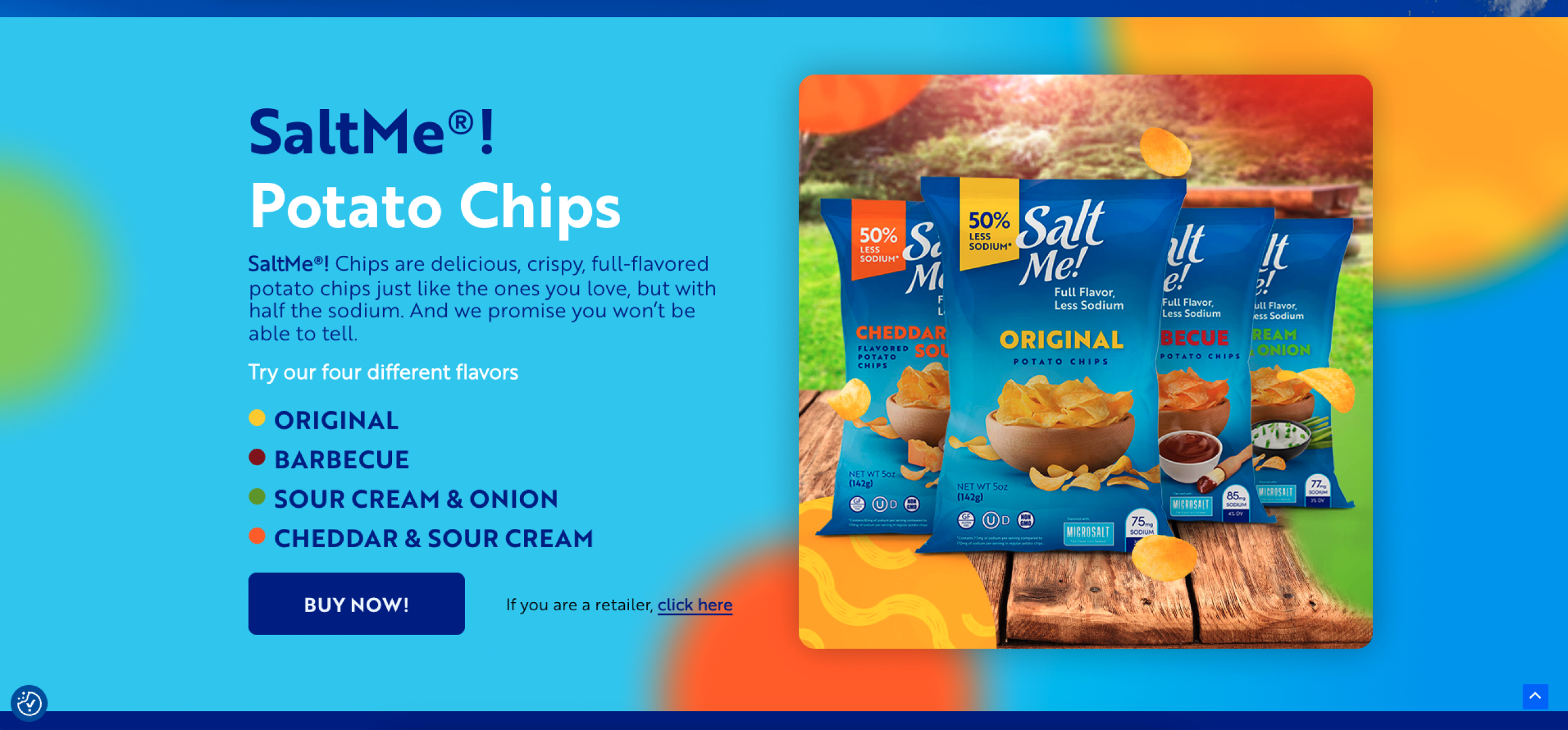
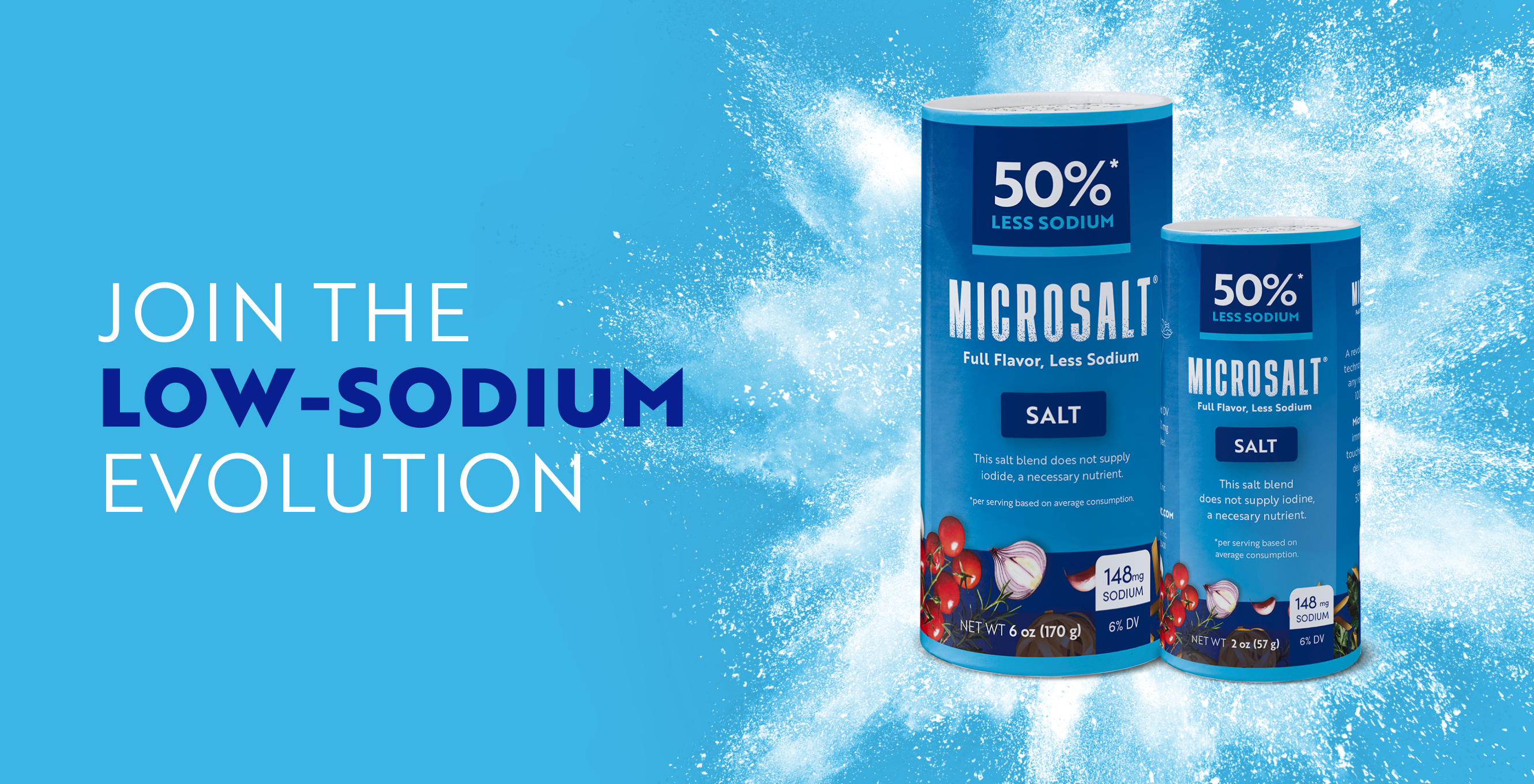
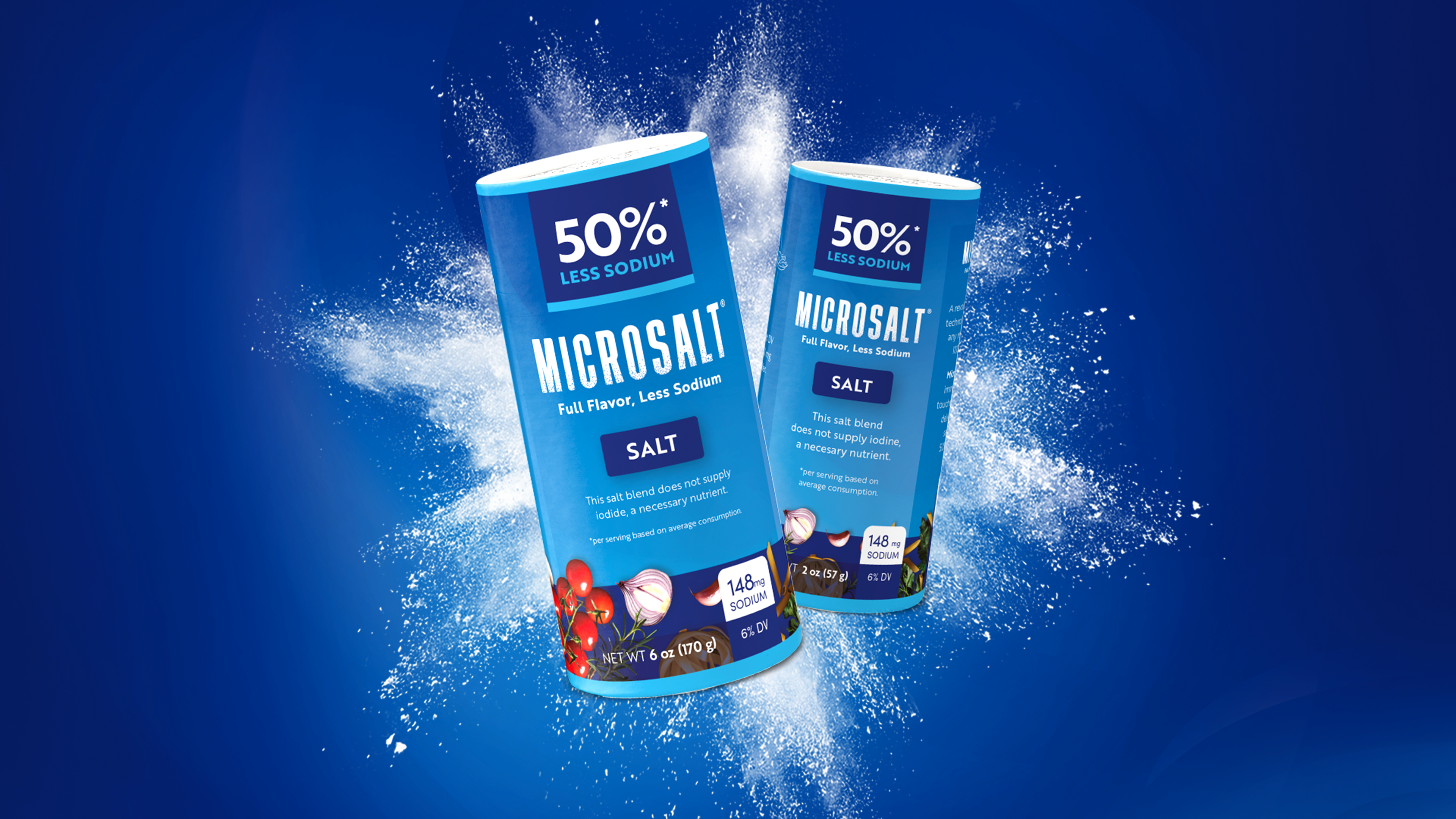
We designed packaging based on the new brand identity that meets multiple requirements: it works as a salt shaker, belongs to the low-sodium world, and at the same time stands out on the shelf.
